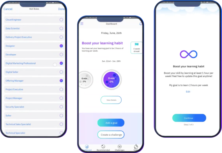
The Product: YL Boost
YL Boost is a lightweight companion app for Your Learning, that focused on goal setting and socializing learning.
The Project: Evaluate the YL Boost Pilot
A pilot version was released to a small audience and the team wanted to determine if the app was ready to launch to a wider audience.
Get User Feedback
Collect user feedback from the 250 pilot users.
Provide recommendations
Propose changes needed to the user experience.
Advise on Deployment
Assess whether the product was ready to exit pilot.
My Role: User Researcher
I was the user researcher lead on this role and had some part-time assistance from junior researcher in running usability tests.
Planning: Timeline and Research Plan
I constructed a research plan based around the 1 month pilot time frame and my 50% availability.
Usage Analytics
Asked to get analytic services set up so we could get quantitative usage data
Usability Testing
Planned for a usability test to evaluate key tasks and probe for usability issues.
In App Pilot Surveys
Planned for an in-app pilot survey, alongside standard NPS and Feedback Form
Limitations
Due to budget and time constraints, there were several major limitations imposed on my desired research plan.
No Analytics
The team did not have capability to set up analytics for the pilot phase
Surveys had to be emailed
The team would not prioritize ticket to activate in-app survey delivery for NPS, Feedback form, and special pilot survey. I had to rely on direct email and slack messaging.
Pilot Survey: Survey Construction
With no analytics capability, the survey was our best chance to get some quantitative data, and data at some scale, on user satisfaction
Well understood and honored metric that could easily speak to the product owner and stakeholders on the success or failure of the pilot.
Every project has some core objectives it is trying to accomplish. At IBM these are often called the Hills.
During the pilot I wanted to evaluate whether the Pilot had achieved the user related hills.
In this project the user oriented hills were
- To design a tool that promoted and supported a continuous learning habit.
- To allow users to set goals and track their progress towards those goals
General usefulness of the product, intuitiveness, and visual design are all elements I commonly ask about.
In addition to very high level questions, I added some questions on the main features of the application to see if there were any specific areas the stood out as especially good or problematic.
I also like to make sure to include a free form area i this kind of a survey. In this case I wanted to prompt the user specifically for something that was working and something that was not.
Since we knew our pilot audience exactly in this case, distribution was relatively easy. I provided direct email of the survey to our user’s work email addresses, with 2 reminders. I also posted direct link to the survey on our slack channel. With cookie based precautions configured in Survey Gizmo to prevent duplicate submissions.
Pilot Survey: Survey Anaysis
After a two week period, with two reminder emails, I closed the survey and analyzed the results
Here you can see aa high level summary deck I put together for discussion with the team
In this case, our pilot audience was not very engaged. WIth only a 5% participation rate amongst our audience, I had to be careful in how I presented the findings. As such I focused on statistically projected agreement percentage ranges based on our sample size. This was derived by the standard deviation of the responses to agreement scaled likert questions. Those with high average agreement scores and lower standard deviation indicated with more confidence a likely satisfaction amongst our wider audience.
Even though we did not have very high volume of responses, this allowed us to use risk management to assess what areas required more focus. Even with a small sample size, the projected satisfaction range for “intuitive and easy to use design” was low enough for me to confidently say we needed more focus on the design before deploying.
Usability Testing
I decided to run remote moderated usability tests with pilot users to get behavioural and evaluative data on the pilot.
The app had both a mobile and web version, and both were fairly different. Because of this, I felt it was important to conduct the study on 2 user groups. My target was 5-8 web participants and 5-8 mobile participants. This was based on industry best practices and my own past experience with this being the “Sweet spot” number of users to get good insights without too much diminishing returns on time investment.
I created a test script that focused on the top 4 tasks in the application. Allowing some time for free exploration as well.
I encouraged user to use “think out loud protocol” to get insights into their thought process and expectations as they used the application.
I recorded completion and satisfaction metrics for each task as well as errors encountered and general user comments and feedback.
Upon completed, I analyzed all notes and compiled the satisfaction and error rates.
I created a side deck to communicate findings with the team. Because the mobile and web application were so different, and because they had separate teams working on them, I kept the reports separate.
The presentation focuses on the issues that were identified through the testing and on my proposed recommendations to address them.
(Separate reports created for web and mobile. Web report shown below)