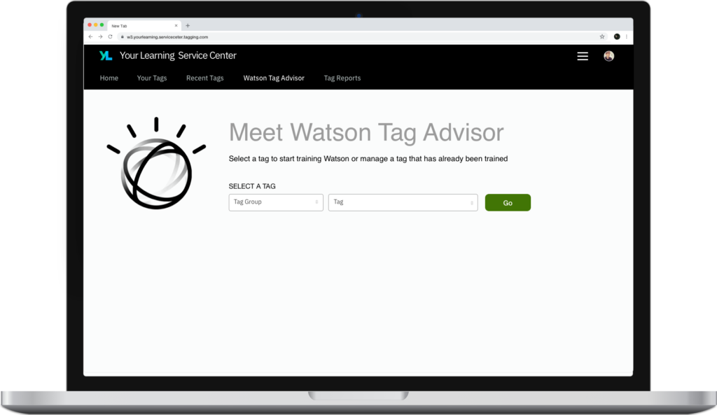
The Product: Watson Tag Advisor
An app to improve content curation by offering AI assistance to learning professionals
What is Watson Tag Advisor?
Watson Tag Advisor is part of the Learning Service Center, where learning professionals create, manage, and report on learning. Tagging is critical in organizing the content on many of IBM’s learning applications.
Watson Tag Advisor was built to assist learning professionals, who are responsible for specific Primarily, it assists with the curation of the nearly endless stream of new content in an ever changing taxonomy.
The Project: Improve learning curation
Watson Tag Advisor was the result of a project that had 3 high level goals
Improve Search/Browse UX
Our user-facing goal was to improve the search and browse experience in the IBM Your Learning application
Simplify Curation for Admins
We traced a lot of issues with search/browse back to curation. Existing tools and methods made it difficult for SMEs to handle curation, which impacted what was shown to end-users.
Utilize AI
IBM invested heavily in AI and there was a mandate to make use of Watson in all areas of the business. This was a great opportunity to do so.
My Role: UX Designer
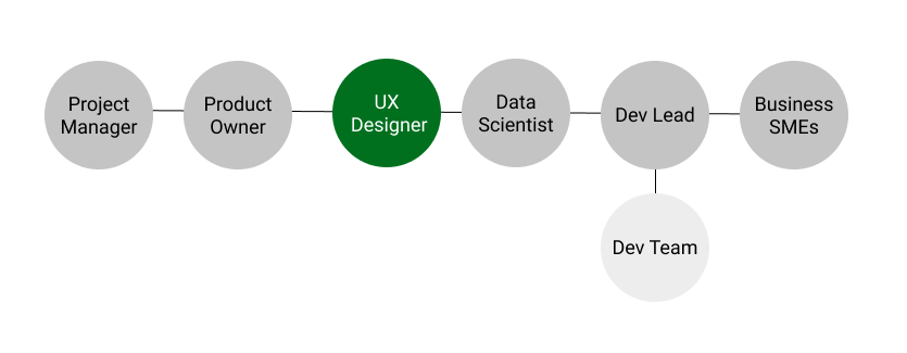
I was the only UX professional on the project and worked closely with the product owner, data scientists, and business SMEs. I designed the application and conducted related user research.
Design Thinking: Envisioning the To-Be State
I started the project by gaining an understanding of the system capabilities and the needs and pain points of learners and learning professionals.
I had several calls with the dev team and product owner to understand the how the tagging system worked and how it ultimately led to the search results and activity recommendations. Having a clear understanding of the processes and data at work was key in trying to envision a solution.
Via our feedback form I was able to reach out to several learners who complained about inaccurate search results or recommendations. Diving into their scenarios I could see where the tagging system was failing.
I met with several learning professionals in a focus group session to talk through their work process and their challenges around tagging. This validated many of the team’s assumptions and gave us clarity on the problem we needed to address.
I facilitated a design thinking call where, as a team, we created a to-be scenario map. This gave us a roadmap to what we would be building and I would be designing.
Design Phase: Early Design Artifacts
I like to start most projects, especially brand new products, with some very crude visuals as early in the process as possible.
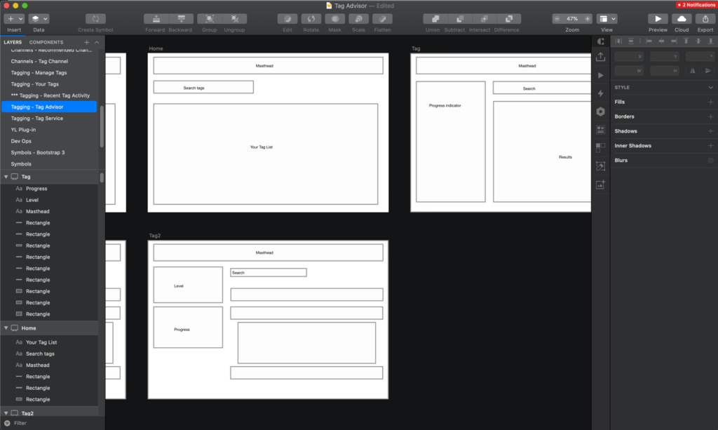
I used sketch to create some quick wireframes to talk through design concepts with the team. This helped make some very quick discoveries about the design informed some of views and page elements we would need.
The next step is to create a concept model, or early wireframes. I usually do this in Sketch, and they are very similar to the high fidelity mockups, except i spend little time thinking about the visual design and do not mockup all the various UI states. I focus on provided basic mockups with the key page elements and user interaction flow. These are then refined and eventually end up as the high fidelity mockups after many iterations.
For this project I no longer have access to the old version of the sketch file which had these original concept mockups, but they were basically a less detailed version of the end sketch file with design elements that differed as we made discoveries and received feedback on the UI.
Design Phase: Sketch Mockups
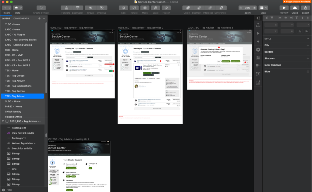
As the concept models evolve and the task flows and features become clearer, I transition to more detailed sketch mockups.
Using Sketch I created a set of high fidelity mockups that illustrated all the various states and interactions of the system. At this stage, visual design gains focus as well.
These mockups go through many rounds of polish and review before being finalized.
I add annotations to the mockups to provide additional context for developers or to explain aspects of the UI that are not easily captured though visuals alone.
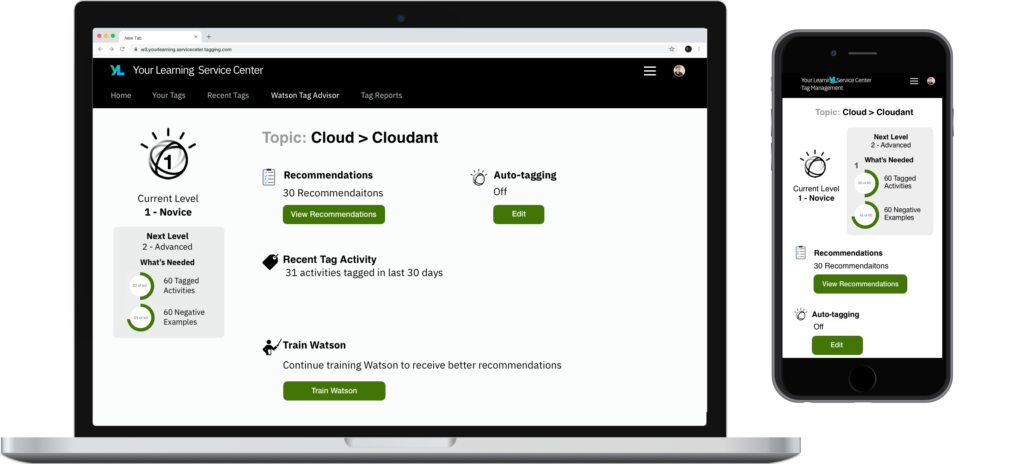
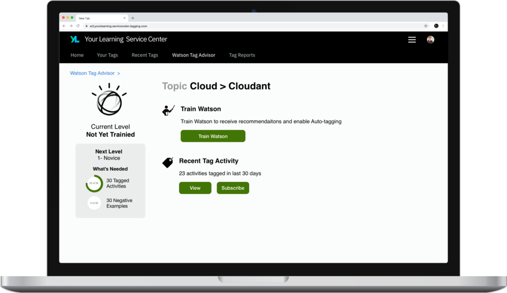
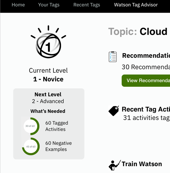
Design Rationale: Level Up Mechanic
I used a level-up and gamified UI to address one of our key product challenges
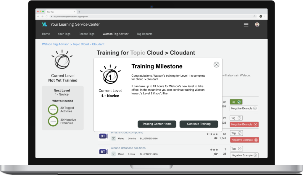
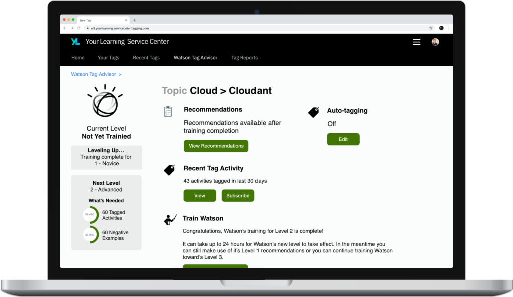
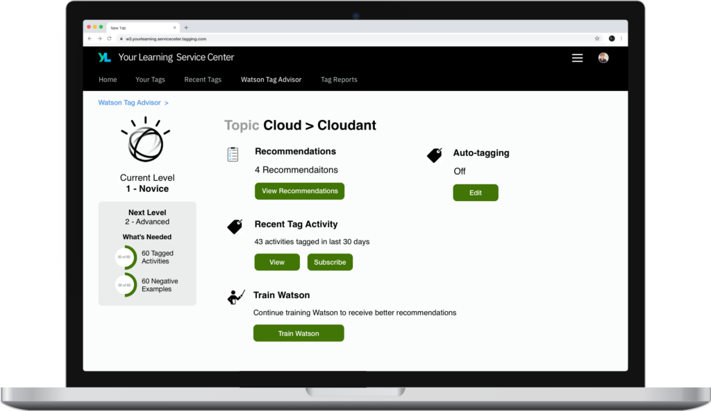
Though we were using AI to greatly improve the efficiency of the tagging process, success still depending on learning professionals providing the initial training data into the system for each tag. This meant they still would have to provide over a 100 positive and negative examples for each tag to train Watson well enough to reliably tag content on it’s own. We needed to encourage this behavior and nudge the learning professionals along.
I decided gamification would be useful in this context and worked with the dev team to establish a leveling system. The leveling system provides motivation to the user to keep going, to achieve that next level. It is a little different than what you normally see, since in this context you are leveling the system rather than yourself, but many of the principles still applied and it worked out well.
Another benefit of the level system is that it shows clear and meaningful progress to the user. The progress dials provide live feedback, offering positive reinforcement of their actions on the table data. They can easily see how far they have to go. And reseting these dials at every level prevents the task from feeling overwhelming at the start. You are always focused on just the next level rather than getting all the way to expert level right off the gate.
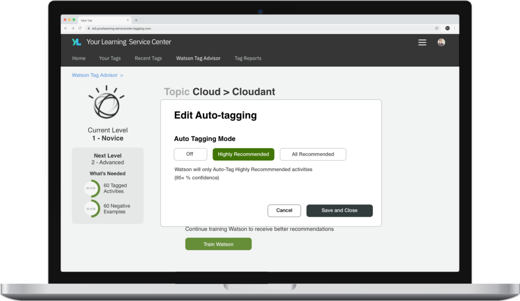
The other method of showing progress its the level itself. Each level has different capabilities. You can’t turn on full automation until expert level, but hitting novice and advance do allow for other semi automatic functions that can assist the learning professional. So their is meaning in partial training.
Training a neural net is a complex process, but I aimed to make it as simple as possible. This widget provides a clear indication of where you are now in the process, what’s next, and exactly what you have left to do to achieve it.
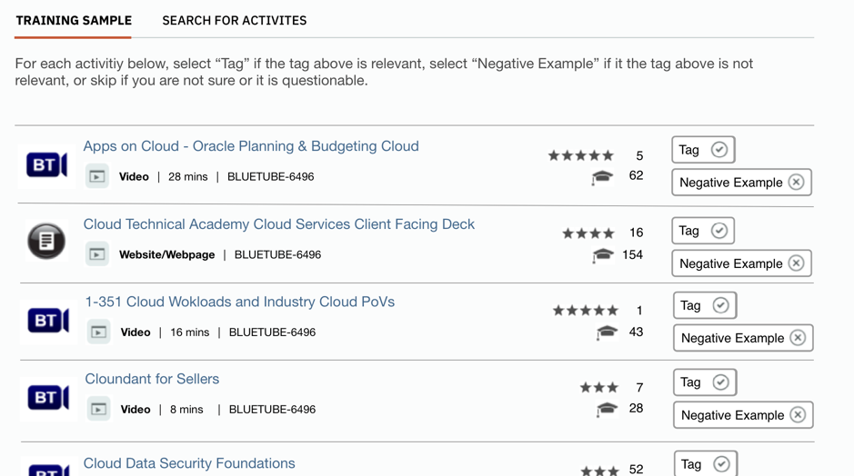
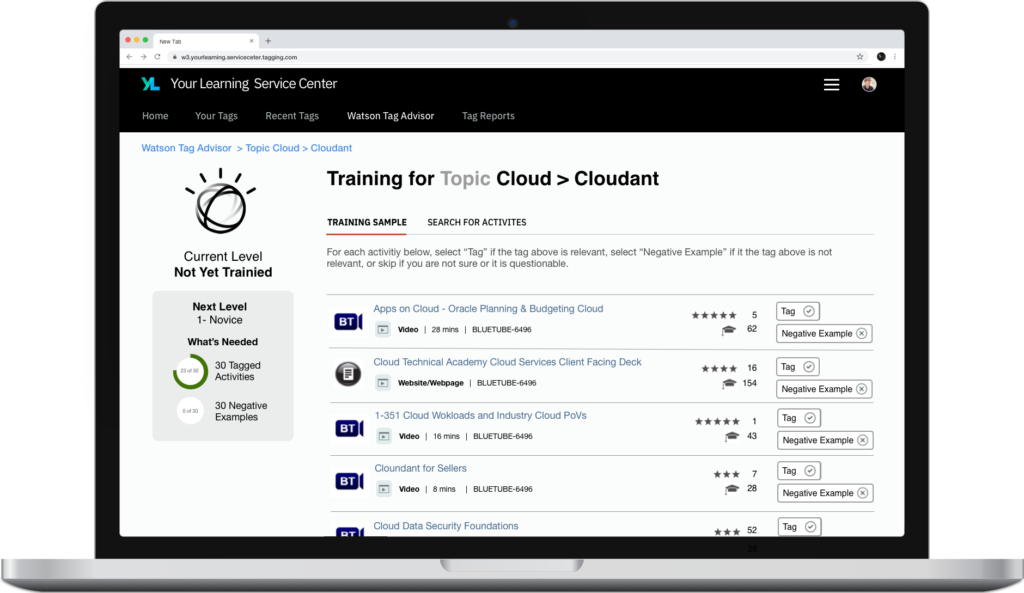
Design Rationale: Table Design
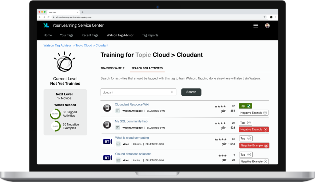
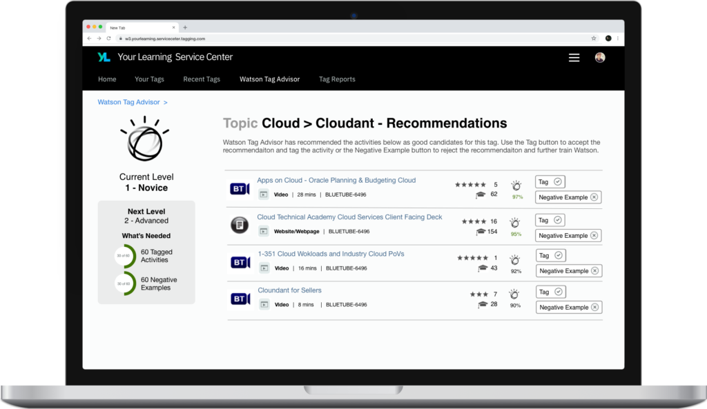
The sample set table display is one of the key elements of the system, and critical to efficient use of the product.
For the system to work, the user needs to be able to quickly and efficiently train the algorithm. We also need a way to make the task clear, in that you are not just looking for good examples of a tag, you have to identify bad examples as well to train the AI correctly. This concept was a bit foreign to most users.
The learning professionals were familiar with a lot of the content in the system, especially items that were positive examples, so I needed a design that would allow them to quickly identify and categorize the items they were familiar with.
We had a standard row layout already in the YL search results, so rather than create something totally new, I made adjustments to the old view adding the actions buttons, but keeping the data fields and alignment the same. Even though in this case, the content type or duration or ID were not incredibly relevant to the choice at hand, they were familiar to the end user and key components in their ability to recognize activities from a list, since they were so used to seeing them in the old context.
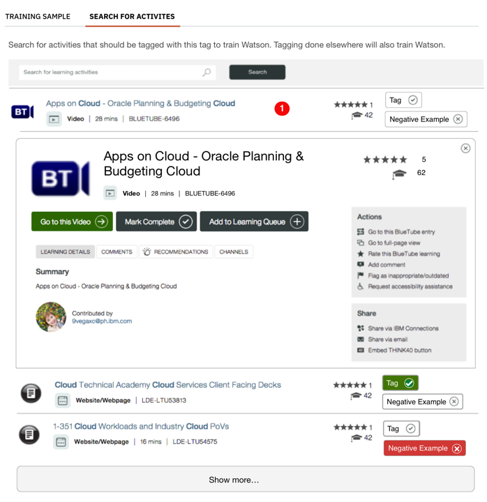
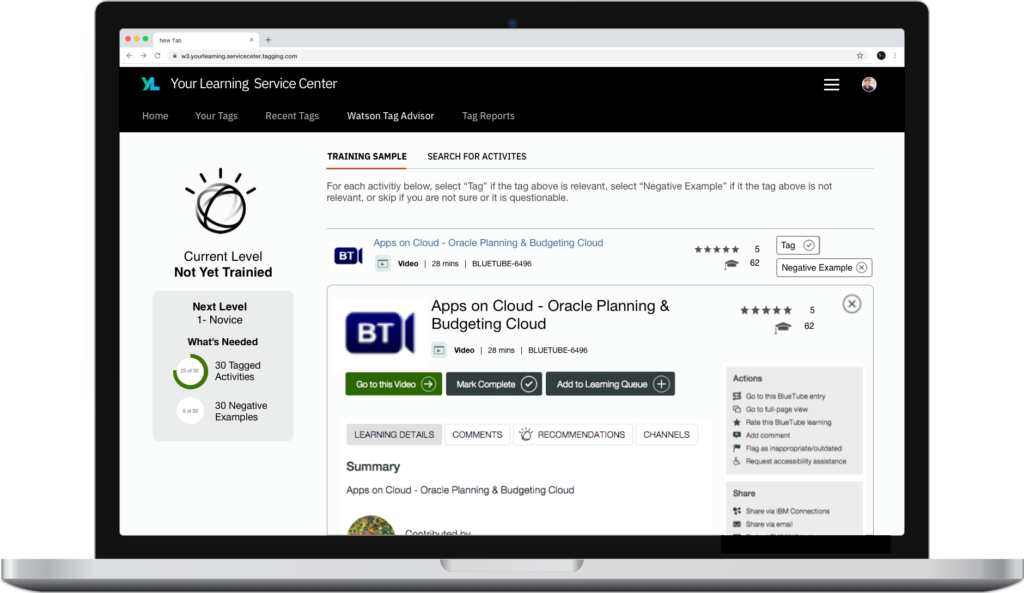
Again, this table shared similarities with our search page, in that sometimes a suer will want to see more information on an activity, in this case to judge if it is a positive or negative example
However, in this case, the use case was a little different. In our normal search, clicking on an activity opened a modal where focus was given to the activity. However, in this case, efficiency of task was very important. So modal would not be ideal, because it would require extra clicks on every item you viewed to close the modal, as well as a constantly shifting display format, which would be jarring when viewing a transition between table and modal, possibly hundreds of times. To solve this problem, I went with an expanding row approach. Once the row was expanded, the user could choose to use the tag or negative example button, or simply keep scrolling past it. Without having extra clicks or having to realign their view to new UI elements.
One compromise I had to make was on the expanded row design. The dev team wanted to reuse an existing control for the expanded row. This meant we had to keep all the UI elements the same, including the overwhelming number of actions and buttons. None of those actions are likely to be used by the learning professional in this context. So I would have preferred to strip all of that out and focus only on the information and actions that help the learning professional determine if this activity was related to this tag or not.