The Product: "Your Learning"
IBM’s main employee education platform
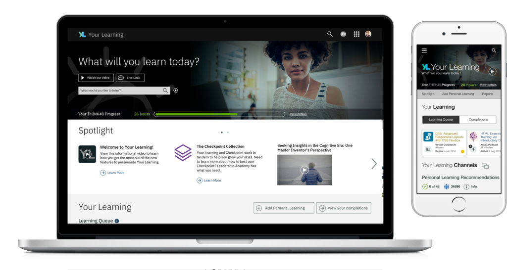
What is Your Learning?
Your Learning is a learning management and learning delivery system providing education and career development for employees. It is used internally at IBM and is a commercial product that is used by several large enterprises around the world.
The Project: A Complete Redesign
The team was tasked with redesigning the app with three core objectives
Discover and Address Top User Needs
Our mission was to leverage user research to identify and prioritize UX enhancements and then conduct further research to ensure our enhancements met user needs.
Mobile First Redesign
The original product offered no real mobile experience. With a growing number of IBMers and customers using mobile devices for learning, we needed a solution that was built for these users.
Modernize the Tech Stack
Rebuild using modern tech languages and techniques to perform as a single page app that will run faster and smoother than the original.
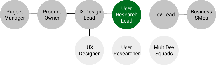
My Role: User Research Lead
I was tasked with planning and providing end to end research support. I worked closely with the project team and had assistance from a part time JR researcher.
Planning: Timeline and Research Plan
I constructed a research plan around the initial 6 month timeline, assuming 1/2 time support. Project delays and pauses impacted this.
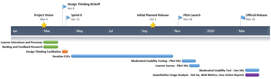
Discovery Phase: Interviews and Personas
Having a small head start meant there was opportunity for some generative research to drive the conversation, especially around the user needs elements.
Team had no past persona documentation or user group definitions.
I wanted to make sure we all had a common and grounded understanding of our users and that user input drove the prioritization of any new features.
With only 3 weeks, had to fast track persona creation.
Formed a draft set of personas based on focus group call with SMEs who’ve dealt with learners of all types for years
Conducted 30 1 on 1 interviews with wide variety of learners of different roles, geos, business units, and time with IBM
Finished product was 9 detailed personas used to ground the team with a common understanding of user types
Used to drive Design Thinking sessions, feature prioritization.
Utilized in campaigns by the marketing team
Spawned separate workstream to work on learning content improvement, something not in scope for this project
Discovery Phase: Analyzing the Existing Data
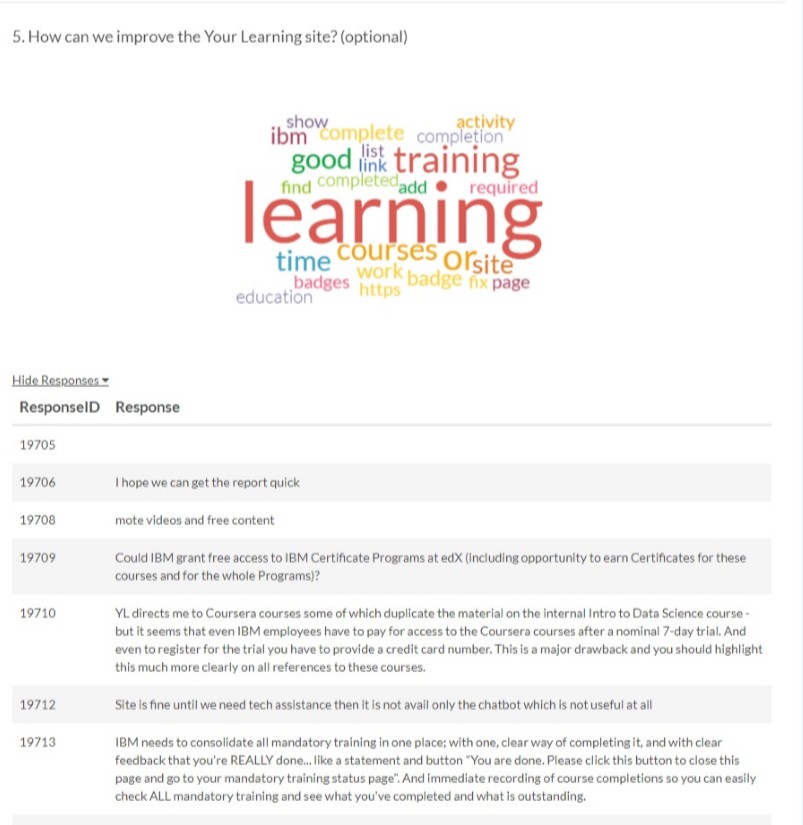
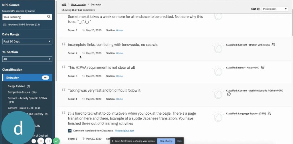
I performed a detailed review and analysis of feedback form responses and UX backlogs
One of my first projects when I became involved with Your Learning prior to this project was to get an NPS and Feedback form system set up for continuous user input.
I had previously set up an in-app NPS widget which provided several thousand responses a month and a self initiated feedback form for users.
With help from a data science team, I trained Watson to categorize feedback into key themes, which helped with this analysis of 30,000+ responses.
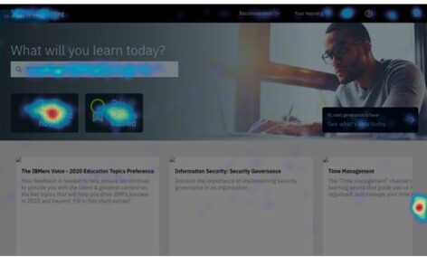
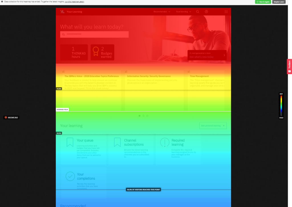
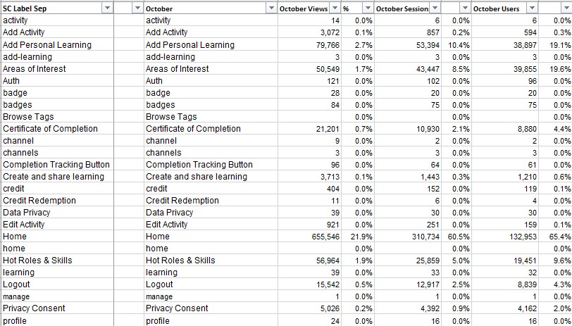
Our web metrics are not the best, but we did have data on page views and we could see a lot of user action data to see what actions they were using or not using, and what kind of objects they were interacting with and where.
I did not perform deep statistical analysis of this data here, but it served to highlight some key trends
Using the above sources, as well as the results of many past studies, I had compiled a UX backlog. This backlog was very useful in defining top UX priorities for this project.
Looking through all of the data I was able to identify some core themes and common pain points which I compiled into a shortlist for the team.
Some of the themes that emerged were…
- Overwhelmed by amount of content
- Issues with completions
- Difficulty with search
- Content issues
- Desire for clear learning paths
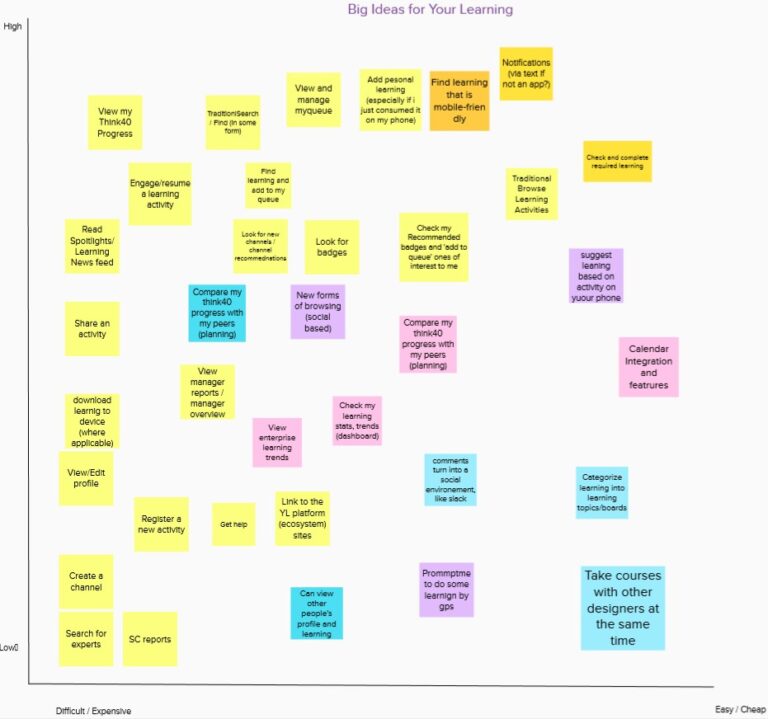
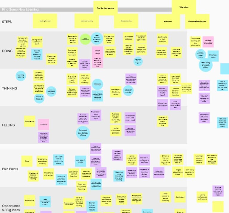
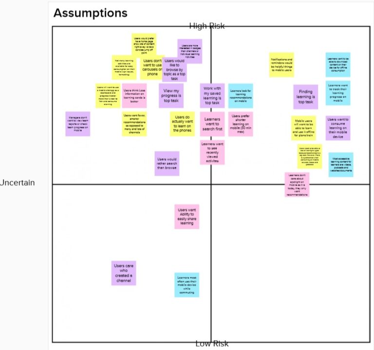
Design Thinking: Leading the workshops
With a UX Architecture background and IBM Design Thinking certification, I acted as facilitator for our teams brainstorming and design kickoff
I set the agenda for a series of meetings and walked the team through a variety of design thinking exercises
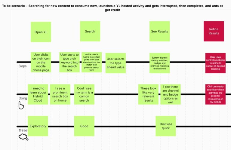
We collaborated to build empathy maps, as-is and to-be scenarios, and idea mapping/prioritizations.
These sessions defined the features and changes we were going to focus on and were the starting point for mockups by the designers.
The ideas that won out, largely influenced by the persona and user feedback work, were improving the search experience, simplifying and reducing the overwhelming amount of content being shown to users, and making it easier to resume in-progress learning.
Design Phase: Iterative Early Usability Evaluations
Working closely with design team, I conducted iterative user feedback sessions evaluating the latest designs or components and bringing the findings back to the designers for enhancements
EUEs, conducted with a handful of users, allowed us to get some quick feedback on portions of the design without waiting for everything to be finalized.
In some cases we could even show multiple options to users and get the to compare and weigh in on preferences. Like comparing to search layout ideas we were exploring.
Because we were moving quick and were early in the project, there was no live or hi fidelity prototype.
The designer linked together invision screens and I used them as a prototype, guiding the user through flows.
Because they aren’t always linked up well and many links or buttons don’t do anything at this stage, I usually drive these sessions myself rather than have the user control.
I was able to convince project leadership to run the first few rounds of tests, but they were not very supportive of early usability evaluations. Despite each round producing insights and recommendations the UX designers found helpful, leadership remained skeptical of feedback coming from low fidelity prototypes. This plus increases in project demands elsewhere meant I was not able to conduct as many rounds as desired.
Pilot Launch: Moderated Usability Test
Behavioural and attitudinal study to evaluate the pilot version of the product
I’ll dive into the details for this particular piece to give more insight into methodology
Objective
- Is the new design intuitive to users?
- Can users complete key tasks?
- What areas are causing confusion or errors and need to be fixed before release?
- Was it ready for launch?
Why a Moderated Usability Test?
- First opportunity in the project to observe users using a live system
- Easiest and fastest way to directly observe top usability issues
- Can ask follow up questions when issues or interesting behavior occurs
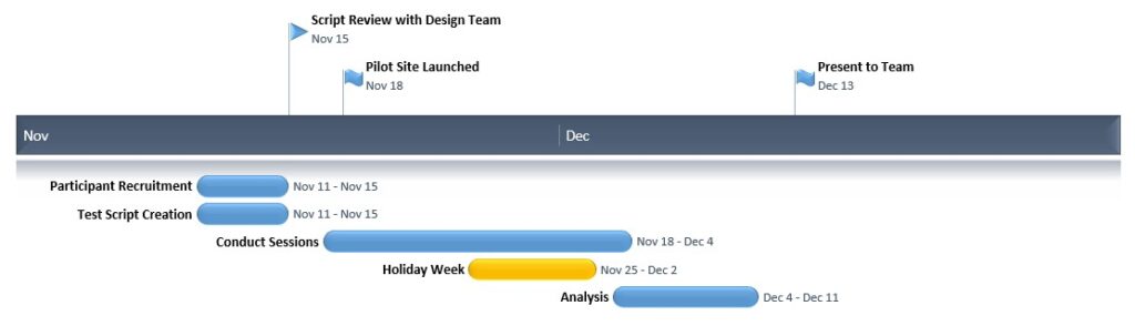
Timeline
- Budgeted 3 weeks (+1 holiday week) for the study with 1/2 – 2/3 time focus
- Construct and internally review script in parallel with recruiting
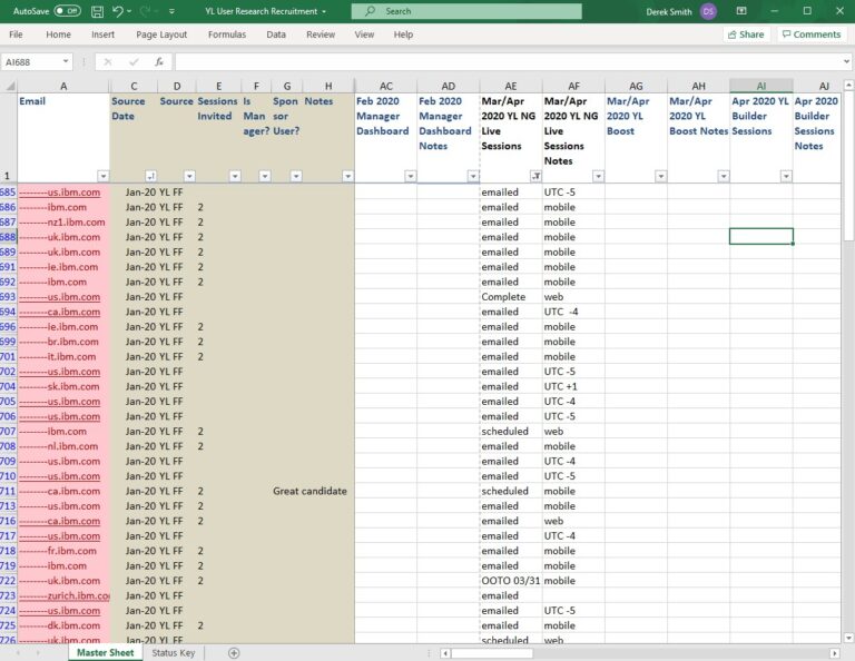
Recruitment
- Targeted 6-10 Web participants and 6-10 Mobile participants
- Balanced participants by geo and job role
- We had recruited imitations
- No compensated for participation
- Inability to cold invite
- Invited from large subset of users who provided email on our site feedback form
Test Script Creation
Considered several points when building script
- What were the biggest changes we made?
- What are the most critical tasks?
- What tasks benefit from live data testings vs invision prototype?
- Areas the design team wants to focus on?
- How much can we get through?
Once draft created, review with team and run a pilot test and revise
Data Capture
- Completion rates
- Errors or issues
- Task satisfaction
- Overall satisfaction
- General observations and user comments
- Targeted questions
- Bugs/Technical Issues
- Survey solution very useful with joint moderators
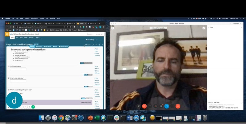
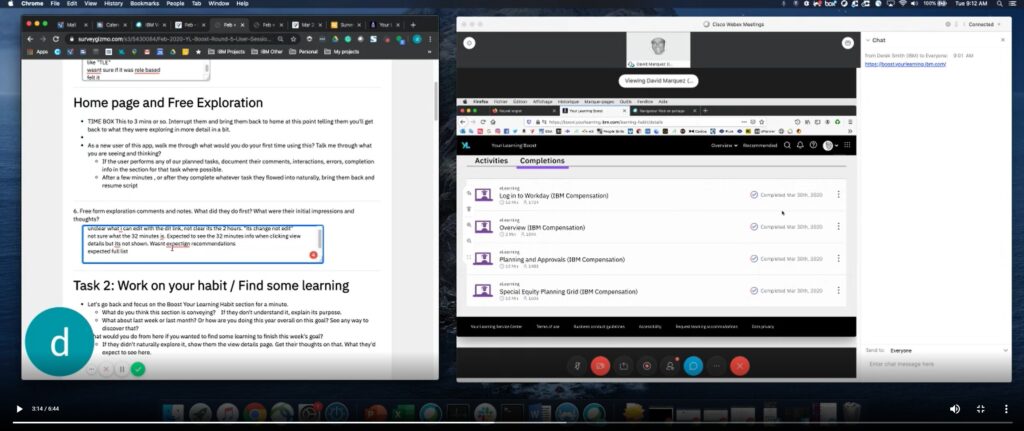
Running the Sessions
- 45 minutes
- 1 on 1
- Recorded remote video call with screen sharing
- Data capture survey with script while viewing participant screen
- Introduction
- Initial (Limited) Free Exploration
- Think out Loud encouragement
- Flow through tasks, as organically as possible
- Task related questions
- Recap discussion
- Extend opportunity to get involved
- Casual, informal conversation style but focused
- Error on side of insights vs perfect data
- Moderator and Logger at same time
- Having run 1000s of sessions, I’ve learned when to bend moderation best practices or go off script.
E.g. once I’ve seen an issue a significant number of times, I may focus less on that part of script to probe other issues or get to stretch tasks. It’s going to be a high sev issue already, so I try to make best use of the time with each participant.
Analyzing the Results
- Review notes
- Session notes
- Post session summary notes
- Running list of issues I’ve noticed
- Rewatch replays as needed
- Meet and coordinate with other moderators if joint research study
- Calculate and summarize basic stats
- Build out detailed issue and observations list
- Organize and Categorize issues by severity
- Build out presentaiton
I’ve used multiple scales in past (severity tied to specific error rates , 5 point scales, in line with dev sev scales, etc)
Advantages to each of those types, but with this team, who I’ve built strong relationship with, used a loose scale.
High: Caused users to fail tasks, or cause of serious errors. Needs to be fixed and should be prioritized over other work.
Medium: Frequent cause of errors or directly linked to significant user
dissatisfaction. Should be fixed as soon as possible.
Low: Caused some minor errors or linked to some user dissatisfaction. Should be fixed when bandwidth and time allow.
The Findings
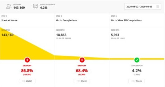
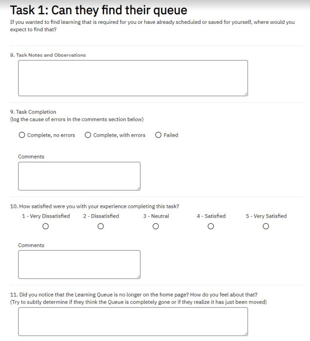
- Users had issue with required learning
- Users struggled with the new location of their learning queue
- Users had difficulty filtering search results
- Users had difficulty applying search filters
- Action menu design was too small and easy to miss
- Many more issues (and technical bugs) were discovered
- Presented to design and product team in a meeting
- Made available on my IBM research portal
- Polish of deliverable sometimes depends on time constraints
- After reviewing findings, Design calls are set up to go into detail and brainstorm on solutions
- Sometimes I will bring sketches of proposals
Impact
WIth the team able to see there were still quite a few things that needed to be addressed, a cycle was added to address many of the high and medium priority issues.
Upon reviewing the results and seeing how users were impacted and their feedback, the design team reworked several areas of the application.
Some examples:
- A middle ground was found between the original full Queue display on home page and removing it completely from home. A Prominent queue summary tile added to the home page.
- Search filter controls were completely redone, making search more visible form the initial result set
- Actions buttons were expanded and given a more prominent icon
NPS was captured amongst pilot users for several months, but when the new changes resulting from the user testing were launched in March, the NPS saw a 14 point improvement

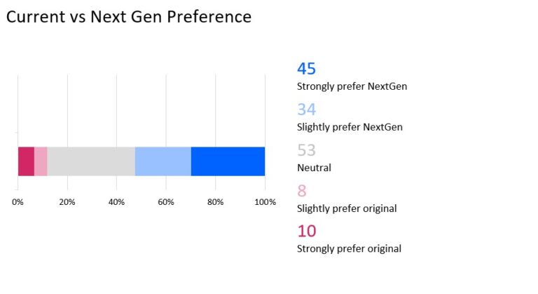
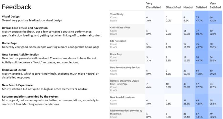
Pilot Launch: Pilot Survey
An attitudinal survey to determine large scale user perception of the redesign and identify areas for improvement
I created an intercept survey to capture feedback from pilot users. The survey was short, to try to encourage a high response rate, and was aimed primarily at helping us get a pulse on whether or not the new site design would be well received or not once rolled out to the company.
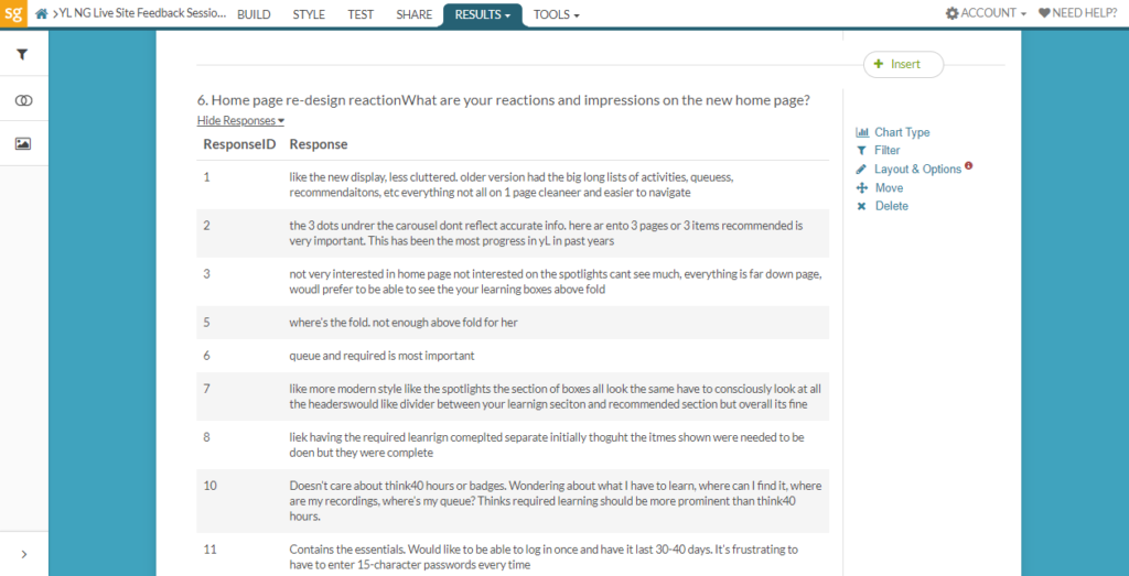
The survey showed a high rate of preference of the new site vs the old site.
It also showed high satisfaction rates on most dimensions of the site we were interested in. However it showed we still potentially had some room for improvement in our search experience.
Post Release: Quantitative Research
Upon formal release of the product I monitored multiple data sources to evaluate the performance and usage of the new version of the app.
After release I closely monitored multiple sources of qualitative and quantitative data to see how the new site was performing and identify any issues that were emerging with higher volume of use.