The Product: IBM Career Paths
An app that shows IBMers potential career paths and steps they can take to pursue them.
What is IBM Career Paths?
IBM wanted a way to encourage career growth and convey to IBMers the different paths their careers could take within the company. This tool was built within IBM CareerSmart.
The mockups attached show the design for the MVP release of Career Paths.
The Project: Establish an MVP Product
We were tasked with defining and designing the initial MVP reelease of this product
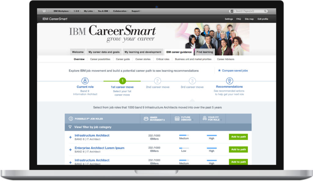
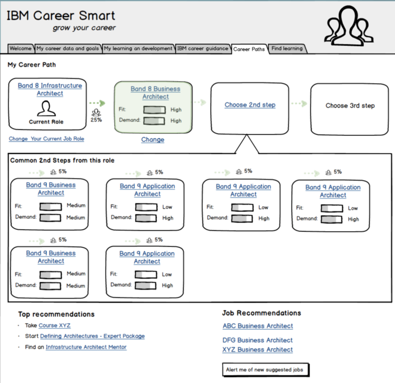
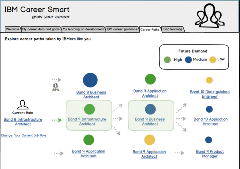
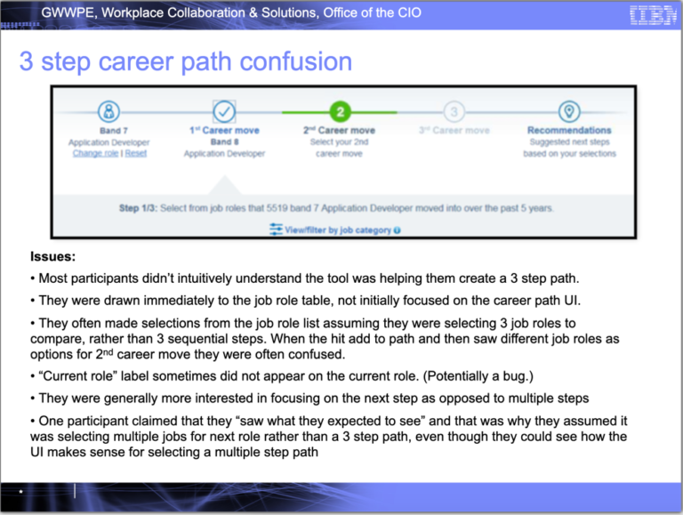
Show multi step paths
Rather than showing a next step, the business had a hard requirement of showing multi step paths several career moves in advance.
Live within CareerSmart
The app had to live within the CareerSmart tool, and thus, leverage it's style guide and pattern as much as possible.
Provide Actionable Insights
In addition to showing possible paths, the tool needed to inform the user of actions they could take to actively move toward the desired career path.
My Role: UX Architect
As UX Architect, my focus was on information architecture and interaction design. I created the low fidelity mockups and relied on a visual designer to turn the low fidelity into polished designs.
Discovery Phase: Early Ideas
I explored a wide variety of career map concepts early in the project
At the start of a project, especially on a new product, I like to explore a wide range of concept before diving into much detail on any of them. These were reviewed with stakeholders, the project team, and end users. We were able to pick out pieces that were working and viable and focus the direction of the design.
This project was done before Sketch and similar products were widely used. Since I was working with a visual designer, my focus was on the information architecture and the interaction design. Balsamiq was a useful tool for creating low fidelity mockups quickly.
Design Thinking: Initial Playback
Once we had defined our objectives and I had completed a rough set of mockups that addressed those objectives, we were ready for our first playback
IBM uses something called a “Playback”, which involves documenting the high level goals of your product (called “Hills”) and then walking through your MVP design to illustrate how it solves those hills.
The playback is presented to the extend stakeholder community and leadership.
Playbacks are repeated as often as necessary from MVP to final design.
Playbacks are mostly managed by the UX resource(s) on the project team. As such, I put together our first playback deck. This walked stakeholders through the pain points were were trying to address, our Hills, and our early mockups of our application, showing how we intended to achieve our Hills.
User Research: EUE and Usability Testing
After initial playback, I began a month-long process of iteratively refining the mockups based on feedback from development and end-user research.
During the early design phase, when all we had were my low fidelity mockups, I conducted 3 rounds of early usability evaluations. This involved me sharing my screen and walking users through some example scenario, capturing their feedback as we went.
Since I was primarily running these sessions for my own benefit, to inform my design choices, I didn’t create any formal documents for these. I just took notes on the insights I obtained.
I completed 2 rounds of moderated usability testing on with end users. One using a loosely linked set of mockups, similar to an invision prototype. The second was conducted on prototype as we got closer to launch.
Design Phase: Iterative Refinements
I continuously refining the mockups.
I iterated on the initial playback mockups 19 times before they were converted into high fi mockups by the visual designer.
As you can see in the examples, once we narrowed in on a design concept to refine from playback 0, the mockups going forward we not high fidelity, but they were also higher fidelity that the very rough format I used for idea exploration.
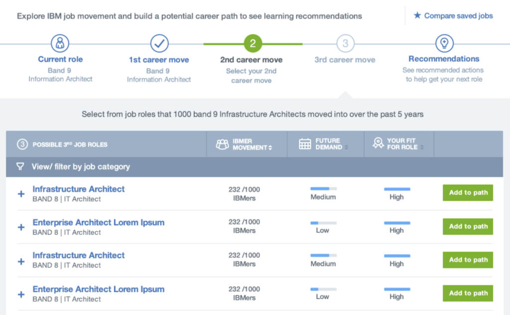
The final mockups were completed by the visual designer. She took my medium fidelity mockups and applied visual polish. At this. point, development had already begun working on the application. From the low and medium fidelity mockups they were able to create the structure of the application, but the find visual mockups defined the CSS.
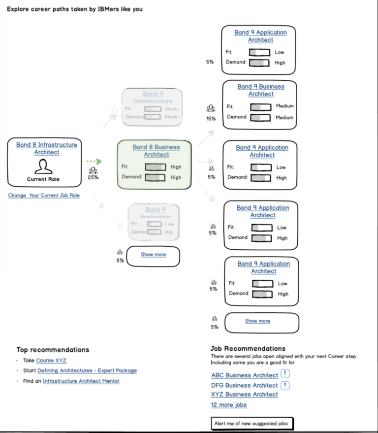
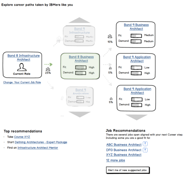
Design Rationale: Single Career Step Focus
Despite the directive to show multiple steps, the information was overwhelming and needed to be focused
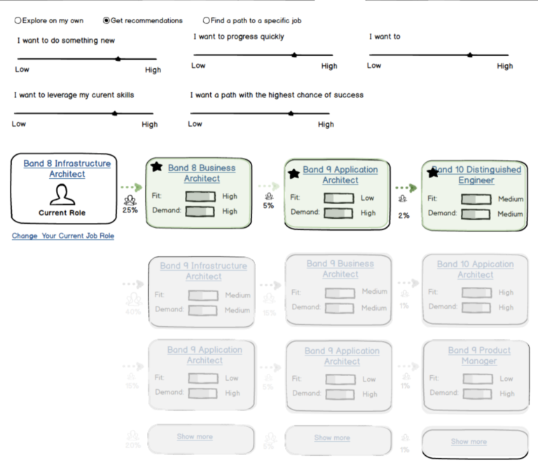
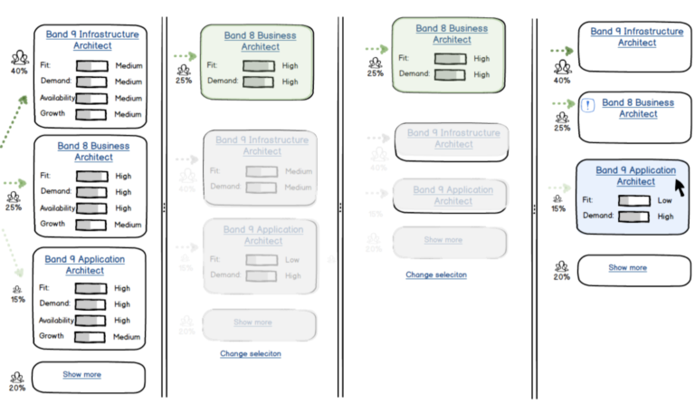
The business was set on allowing the user to explore and lock in a multi step career path, but the problem was that showing all the possible career trajectories, along with associated data to differentiate the options, was too much to contain on a single view.
I tried several approaches in early stages to do this, but continually received feedback that it was overwhelming. You can look back to my screen shots of my early designs to see what I mean.
The solution I went with was to provide a summary view of the multi step career path, similar to a wizard control, and use the majority of the screen real-estate to focus on the important information about the single career step.
You may notice this design is slightly different than our MVP design from above. I adjusted the wizard layout and the business decided to remove the job role filters for business strategy purposes.
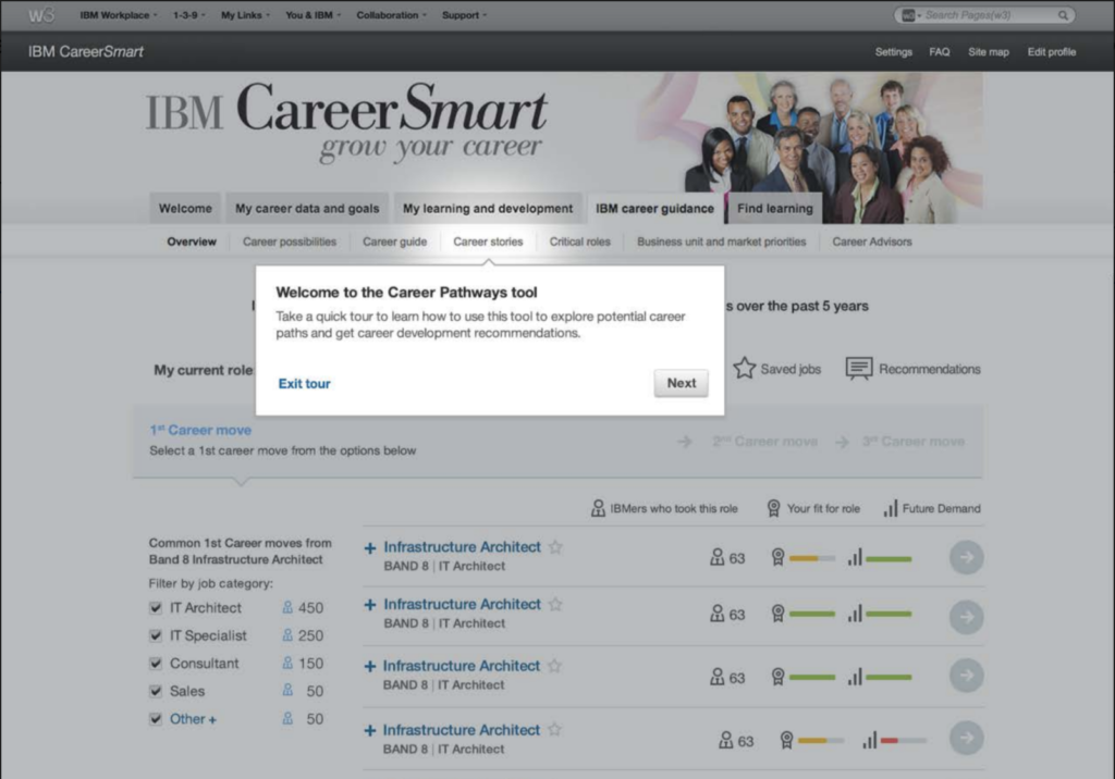
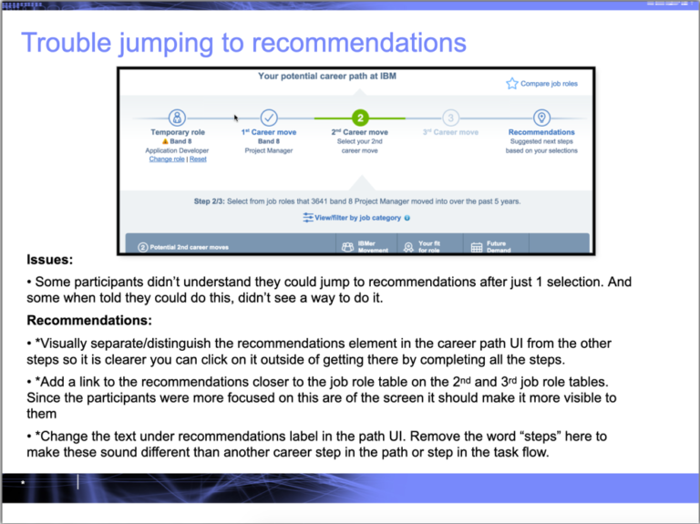
Design Rationale: Guided Tour Experience
Despite the directive to show multiple steps, the information was overwhelming and needed to be focused
User testing discovered that some users who came to this tool within the larger CareerSmart site, without any prior context, were not sure what it was for or how it should be used to drive their career and learning decisions.
One of the main causes of this was that we had to fit this entire complex tool within a single tab of an already complex and overflowing CareerSmart site. This took away a lot of options, where we might have had a separate landing page for the too with intro content and/or videos vs throwing the user right into the data. But trying to do all that with it a single tab wasn’t going to work well.
Our solution was to include a guided tour experience on the first visit. This walked users through the purpose of the tool and it’s key elements.