The Product: Events and Classes
Web app to schedule and deliver online and in-person classes
What is Events and Classes?
Events and Classes is a web app IBM uses to schedule and deliver online and in-person learning
It has both both a front end and back end, as it has two different audiences. Learning professionals and learners. It is a deep and complex app with many functions related to scheduling, delivery methods, financial charges, enrollment tracking, etc.
The Project: Merge and Enhance Legacy Systems
This application merged and added new features to two other applications which I also worked on previously; Event Central and Classroom Central.
Preserve Patterns
Because we had many users familiar with the legacy systems, we wanted to keep things familiar where possible.
Address Design Issues
The legacy products did not have continual design support as they grew, so some elements of the design had major usability issues.
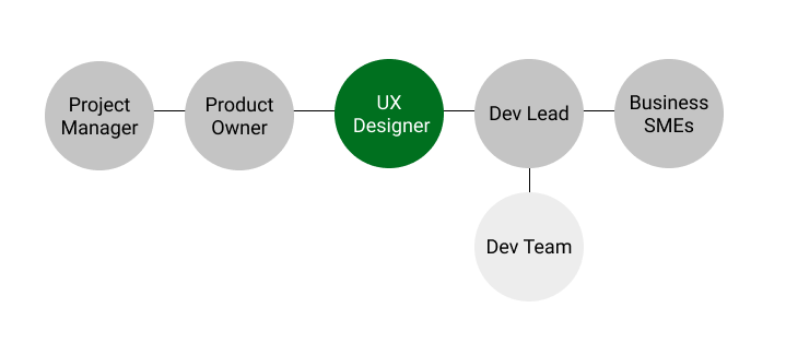
My Role: UX Designer
I was the UX Designer on this project and worked closely with the product owner, development team, and business SMEs.
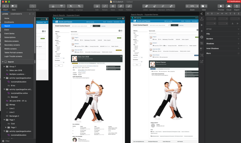
Design Phase: Sketch Mockups
WIth old sketch files from each parent system in hand, I was able to quickly jump into Sketch designs, making adjustments and mergers.
Using Sketch I created a set of high fidelity mockups that illustrated all the various states and interactions of the system.
These mockups went through many rounds of polish and review before being finalized.
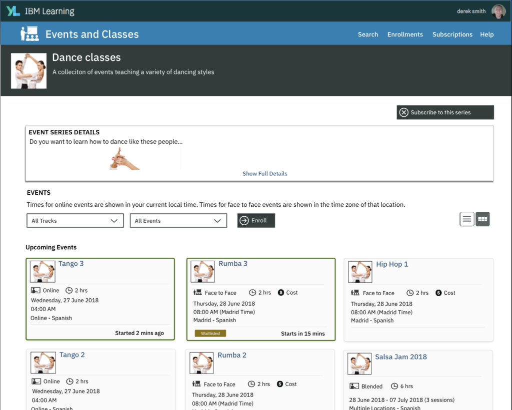
Design Rationale: Truncated Series Description
I used a level-up and gamified UI to address one of our key product challenges
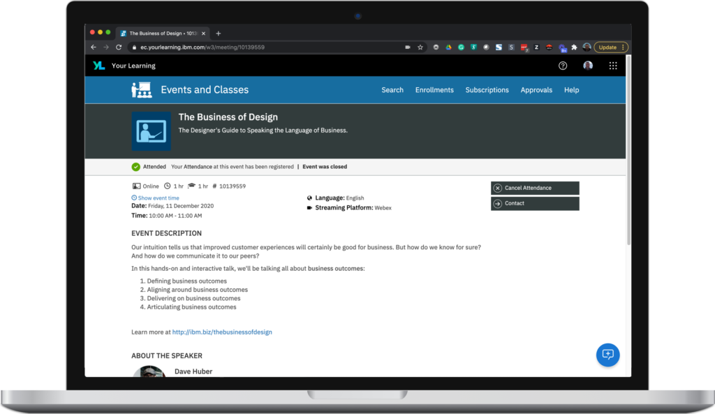
Event series are a chain of ongoing events that are all related. When a user views the details on an event series there are two main use cases.
1. They are new to this series and want to know what it is about.
2. They are already familiar with the series but are returning to explore upcoming events
In scenario #1, it is important to make the description of the series prominent, but it #2, it is just a distraction.
The challenge is that what went in the description area of event series, which existed in legacy systems already, varied immensely. Some series had short descriptions, others had large images and charts and multiple pages of content.
The solution I arrived at was a truncated event description area, which could be expanded easily and push down the upcoming events and past events areas.
This allowed for all users to easily scan over event series description area and get to the upcoming events with ease, no matter how large the description was. Yet it is still very prominent and easily explored by the user who is new to the series.
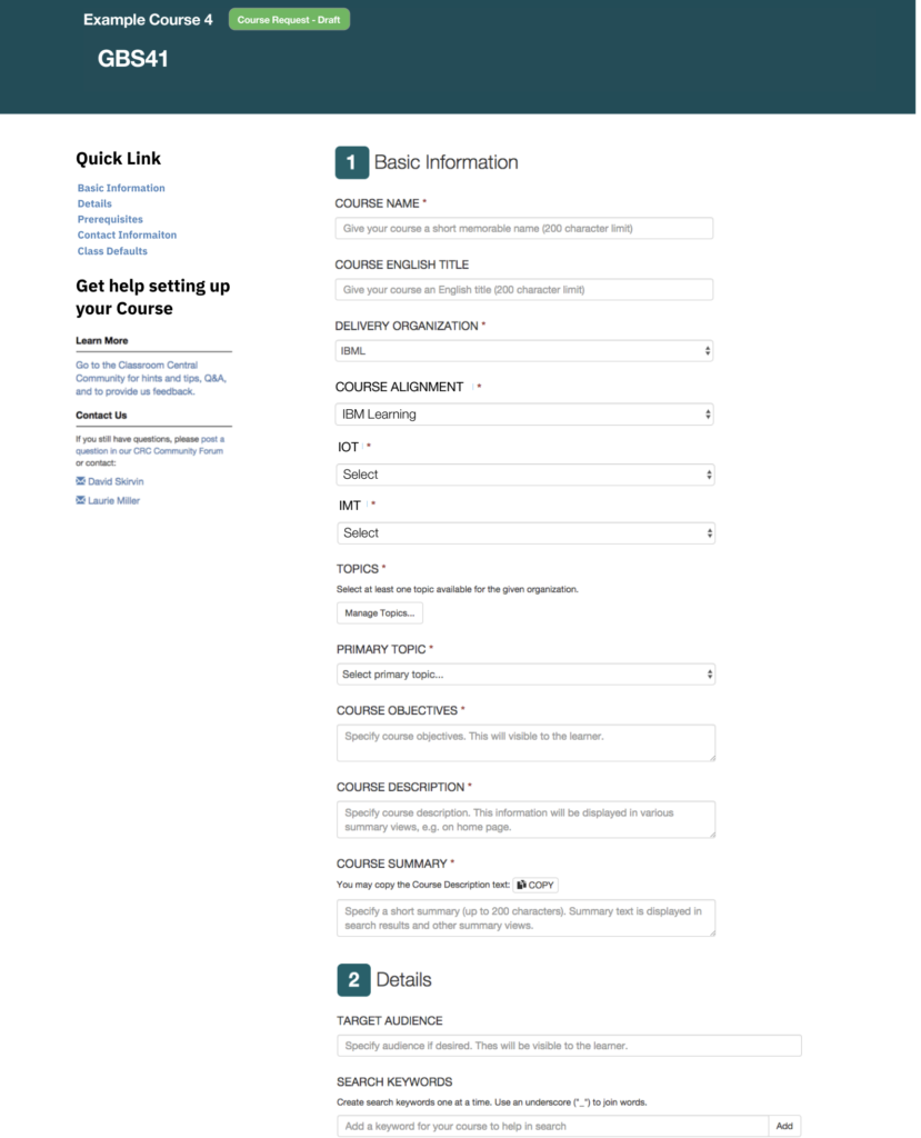
Design Rationale: Sectioned Long Forms
Setting up a course is complex and required a lot of data
There are many fields required to define and set up a course. The old system had a very long page full of fields with nothing to help admins navigate or quickly find the right fields.
I originally thought to redesign this to use a wizard approach, asking the user to focus on one area at time. However, in user research, I discovered that there was a frequent need to edit this data, and the edits might range many different areas. So a wizard would end up requiring them to do a lot of navigation within the course to make edits. For this reason, the long form actually held a significant advantage.
To improve the long form, we worked as a team to group the fields into logical categories.
I then established groupings in the form UI and gave them labels. I also numbered these groupings and provided visual icons to help with scan-ability.
I also added a Quick link section at the top to allow them to quickly jump to the desired section.