The Product: Best Egg Financial Health
A web app to help people manage their finances and convert users to lending customers.
What is Best Egg Financial Health?
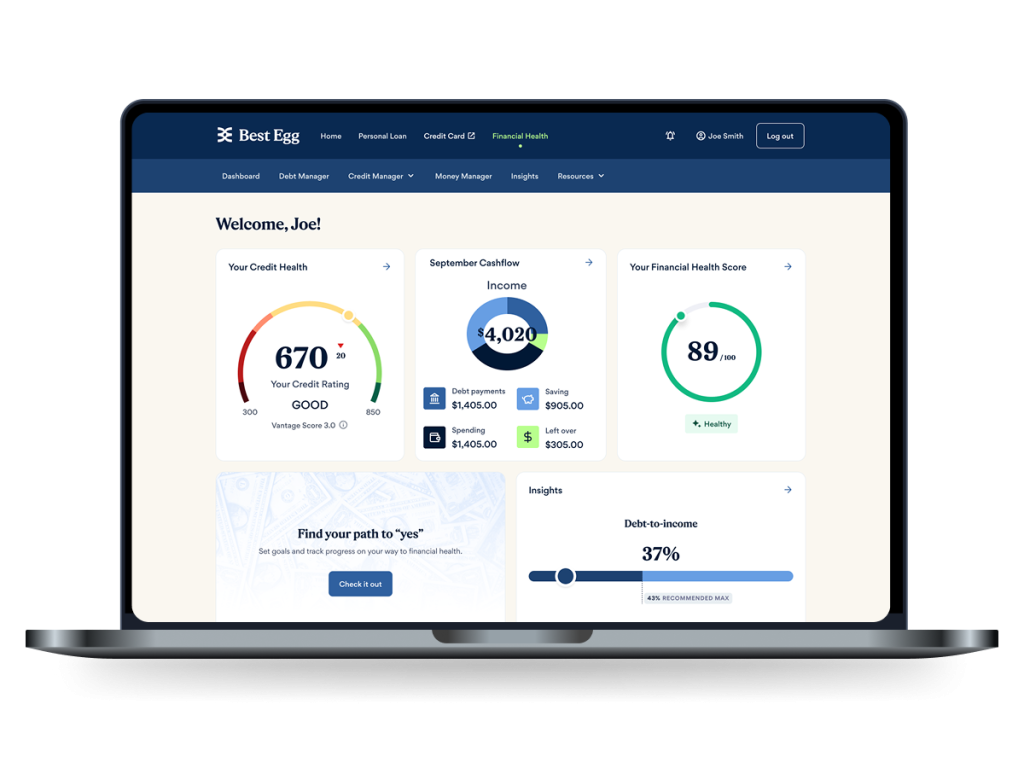
Best Egg Financial Health Is a robust financial tool that helps people track and manage their credit score, spending, savings, and debts.
It was envisioned as a Mint and Credit Karma competitor that the business could use to convert users into lending customers by surfacing debt consolidation and credit card options directly in the users day to day financial monitoring experience.
The Project: Launch a New FInancial Health Tool
Brought on to lead the design of a new product in a new area of business for Best Egg
Help Define MVP With Research
As a totally new product and new devision of the business, user research and expiriments were key to achieving business objectives. I was the only employee in all of Best Egg with UX research so I needed to establish practical research methods to drive the project.
Design and Test New Product
We needed to buld everything from the ground up... new interaction paterns, a new design system, and a new design / develpment process with new team.
Convert Users to Customers
In addition to delivering a product that achieved its advertised funciton of improving users financial health, there was a clear and omni-present imperitive that primarily this product needed to convert users into lending customers.
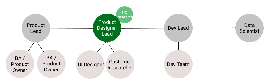
My Role: Product Design Lead
I was the Product Design Lead, working closely with the product, dev, and data science. I directed UI Designer and Customer research. I led designing thinking, created all initial product designs and supplemented marketing based research team with direct UX research.
Design Thinking: Aligning Team on A Vision
As a totally new product, the direction and needs of the tool were very much up in the air. Design thinking sessions, mostly following Google Design Sprint methodology, yeilded HMW statements, early vision cocnepts, and value/effort estimates. This helped allowed product leads to priortize features and begin to form a product backlog. It also identified the some of the questions we needed research to answer.
Lightning talks helped bring our team, many of which were brand new to Best Egg, up to speed with what the company’s experts did know about this new space.
After initial knowledge share we collectively started documenting How Might We Statement, identifying what we thoguht the best and biggest opportunities were within the space.
I lead the team through affinity mapping and collective rating of the emerging HMW themes.
Using out our top HMW statements as a foundaiton, we looked for inspiraiton in other products and brought that back ina central whiteboard to draw inspiraiton from.
We then ran Crazy 8s to allow the team to individually draw a variety of very rough concepts to spark ideas. After a round of voting we were able to align further around highly ratred ideas from the various crazy 8 ideas.
Using the top voted Crazy 8 concepts as a baseline, we each created a rough concept sketch of what an MVP might look like. Discusison and voting around this allowed product owners to form the foundation of MVP requirments and OKRs.
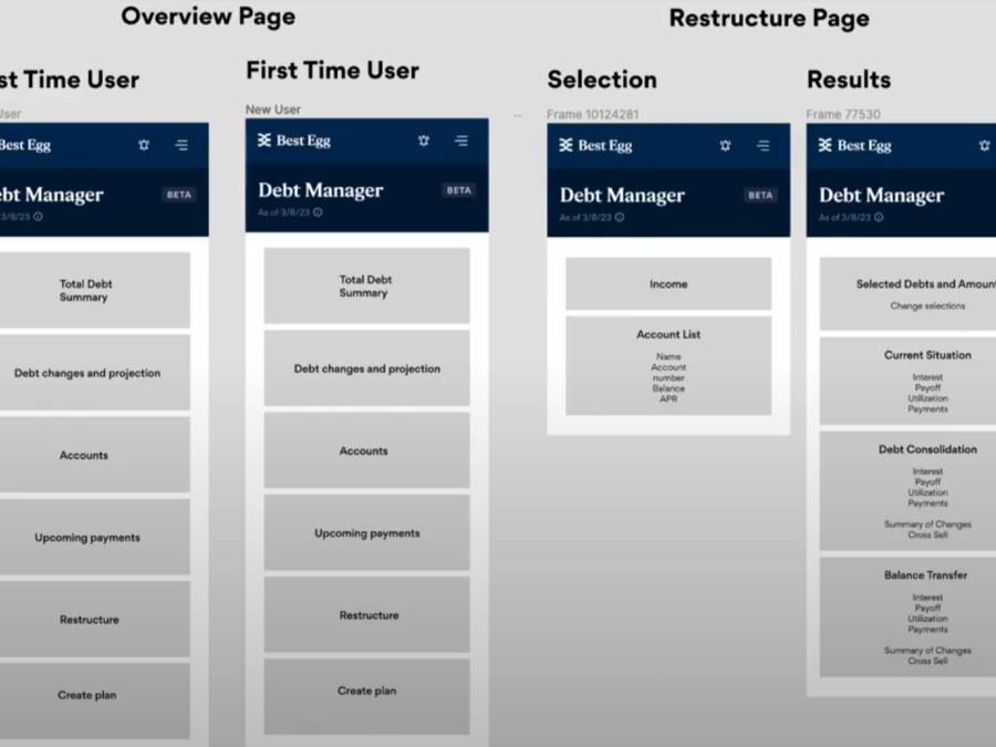
MVP: Integrate Vendor Platform Foundations
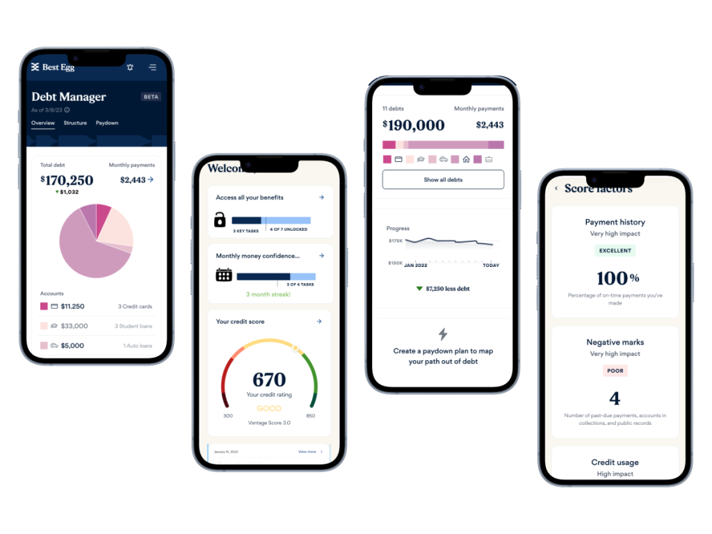
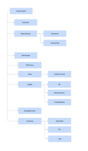
After initial kick off, much of the design work was setting up the table stakes features, like credit score, account balances, etc. This was largely designed for us since we used a vendor product for the base line. The main work was simply fitting it into the existing Best Egg Architecture and alligning on Nav. This mean some IA and UX Architecture work.
I took inventory of existing Best Egg site pages and all pages needed for core features from vendor product and organized them into a To-Be State.
We had some restrictions from vendor solution, but still lots of room to customize. So we needed to use components and interactions that matched other Best Egg products, or set new standards for those. Overall it was a fairly immature design system, so this meant drawing from elements that were good and proposeing new standards for elements that were lacking. I led other UX designers at best egg through updates to the design system where changes were needed based on this effort.
Discovery: Establishing Research Driven Design
Best Egg had no UX research staff or tooling, only experience conducting general consumer interviews, focus groups, and surveys. We needed to establish new a framework for quantatative and qualitative user research to allow us design based on data and experiments.
I lobied for and implemented a UserTesting.com account to allow us to conduct rapid automated user tests to help us experiment and test lo-fi mockups quickly.
I worked with Consumer Research to run new kinds of quantatative surveys on Qualtrics. I ran many behavioral and attitudinal quantatative surveys to test hypothesses on user needs and pain points.
I worked with the product lead and dev lead to set up a framework for A/B tests, which was new to the company.
I set up hotjar to allow us to observe user interactions on the live site and gather insights for new A/B tests and feature concepts.
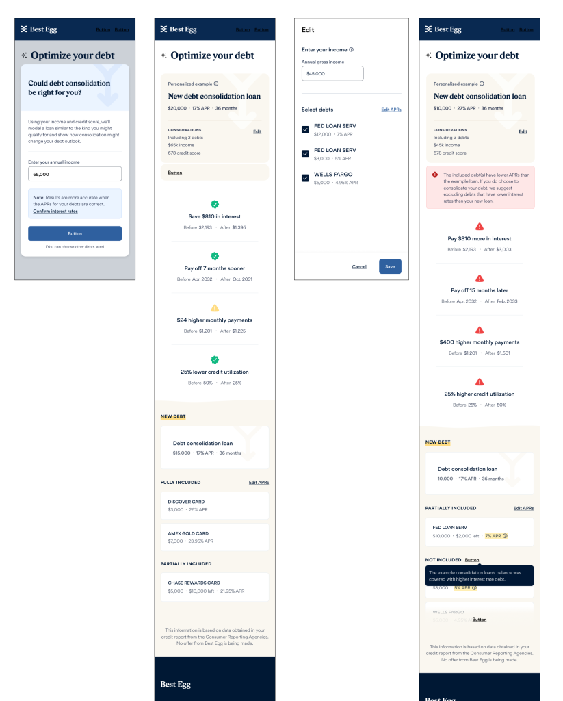
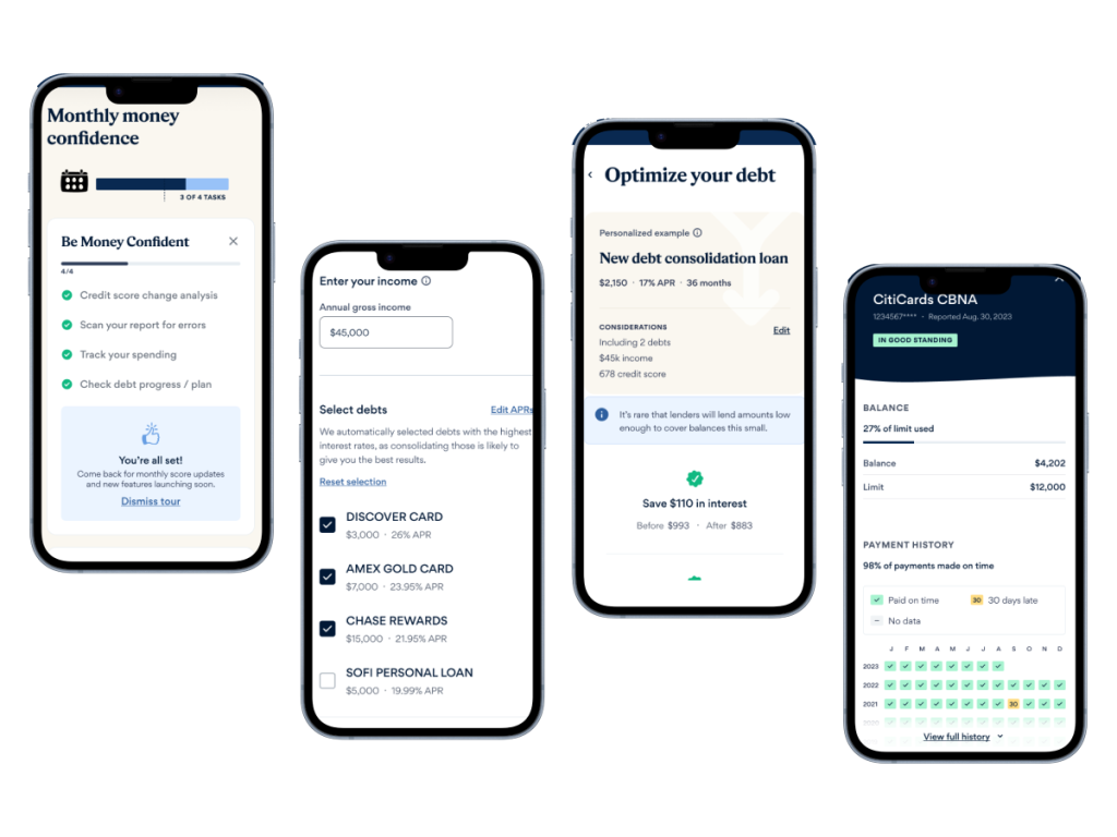
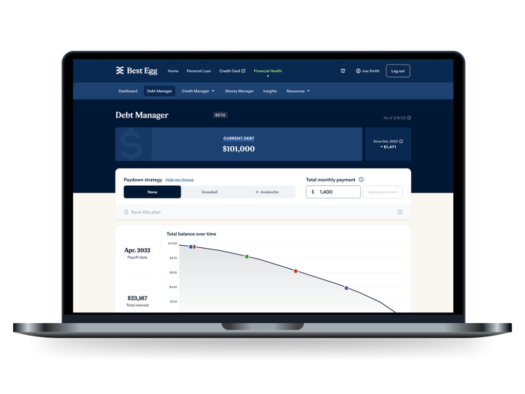
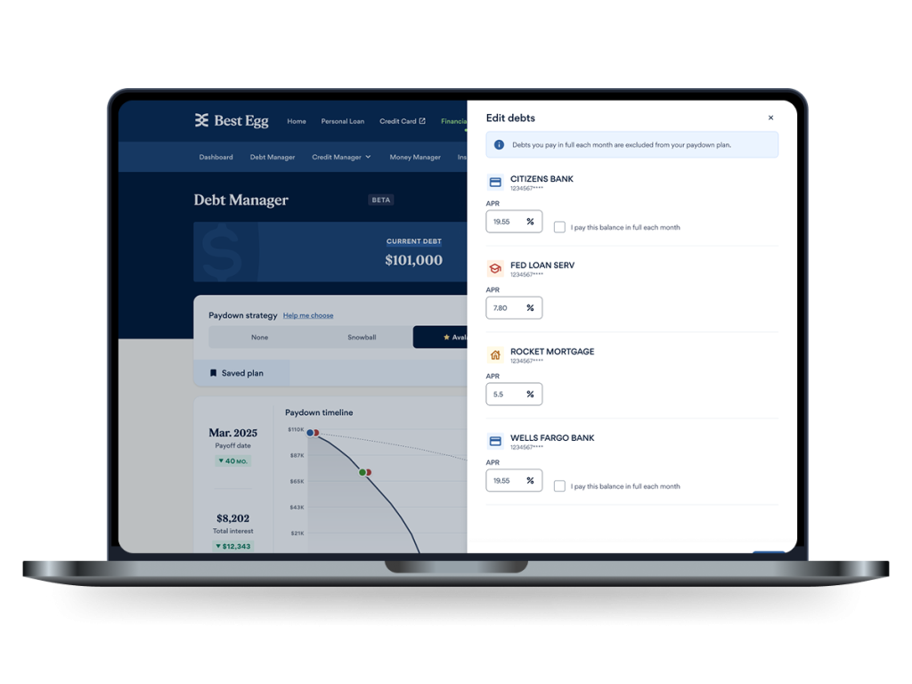
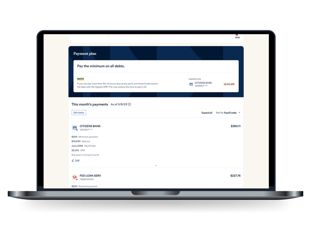
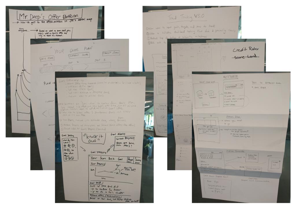
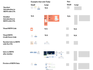
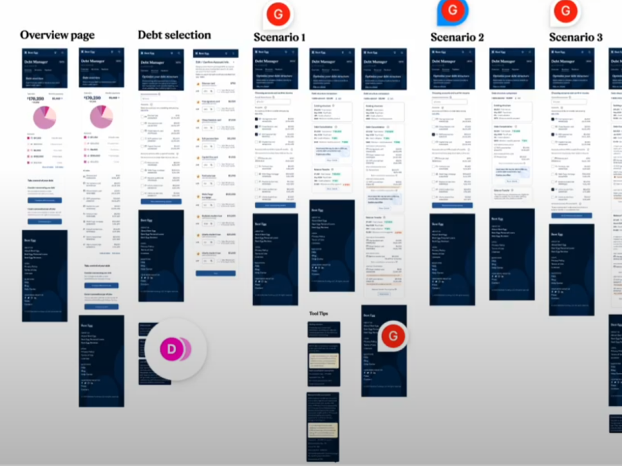
Feature Design: Debt Solution Tool
With table stakes in place, we moved to our first substantial novle feature, aiming to deliver on one of our key objectives, allowing users to build and compare comprehensive debt payoff plans.
I started with Priority maps to figure out what kinds of content and controls we would need and their relative importance to the user.
Many rounds of iterative Lo-Fis were created and discussed with the team and stakeholders.
Using Figma, I created interactive prototypes witht he Lo-Fi designs, with enough fidelity to test key interactions.
Using Lo Fis, Figma prototypes, and Usertesting.com allowed us to move fast. We were able to revise, prtotype, and test again within a week.
We went through several rounds of tweaking the design before moving to Hi Fidelity and a dev handoff. Though UI designer and Dev were abel to start some work in parallel.
Before implementing, we had a plan for how we would capture data on usage to learn and iterate. I worked with the product lead in creating this plan, helping to identify elements and interactions I felt would be key to helping us evaluate the use of the feature beyond business metrics, such as how often were people actually adjusting their plan? Did they link accounts and how many? Was the expanded details view being used and how often.
During Lo-Fi Phase, I came up with many variations for the feature, but we had to move with soemthign as an MVP. After launch we were able to flush out some of those variations and launch them for A/B testing to see if there were differences in key KPIs.
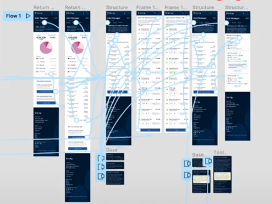
Design Challenge: Intuitive and Persuasive Design For COmplex, Multi-Scenario Debt Restructuring
Many potnetial desired user outcomes, many edge cases, business objective that sometimes is at odds with goal of intuitive design focusing on user control
It was a challenge to balance all the possible motivations and desired outcomes a person might have in their consolidaiton exploration, along with all the possible debt states and edge cases that can occur, make that intuitive for all scenarios, AND also align with business objective of selling and persuading the user to consolidate through the design when it sometimes might be contradictory to user goals.
Many Use Cases:
- Does the user want long term savings?
- Do they want lower payment now to free up cash?
- Do they just want to reduce stress of so many bills to track even if theres an increase in cost?
- How much extra can they afford?